Page Builder
 ](https://docs.joomla.org/GSoC_2019 "GSoC 2019") Joomla! 4.x
Introduction
Imagine someone wants to create a template, but without writing HTML. CSS should be used only for styling and not for defining the layout. Then the Page-builder and the frontend template "Apodis" are helpful tools. The main focus lies on an editor, which makes it possible to create custom-defined positions with the help of a drag & drop GUI. Users can use predefined elements - container, grid, column, module position as well as custom elements. 3rd party developers are able to add their own elements via plugins.
How to start
To use the Page-builder, the activated frontend template needs to have the pagebuilder field in the templateDetails.xml like here from Apodis:
<fieldset name="pagebuilder" label="TPL_APODIS_PAGEBUILDER">
   <field
        name="grid"
        type="pagebuilder"
        hidden="true"
        label="TPL_APODIS_PAGEBUILDER"
   />
</fieldset>
The template itself needs to load the RenderHelper, which renders the parameter, filled by the editor. This happens in the templates index.php.
use Joomla\Component\Templates\Administrator\Helper\RenderHelper;

$grid = $this->params->get('grid');
After that the output is placed inside the HTML body:
<?php echo RenderHelper::renderElements($grid); ?>
Editor
The Page-builder editor is available in the Template Styles and the appropriate tab. It supports adding new elements, drag and drop to rearrange and position them as per one's liking and the ability to resize columns. Nesting of elements is also available and can be altered by changing the plugin settings. This creates nearly boundless possibilities.
Page Builder Editor:

Users can add different elements to the layout by using the "Add Element" button at the bottom of the rows. Then a modal window appears, where they are able to select available elements and set further options directly.

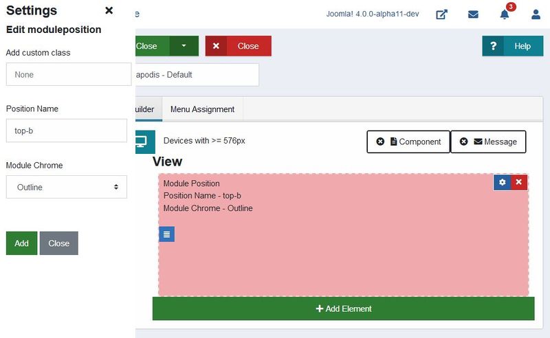
It is possible to add custom CSS classes using the settings icon, present on every element and here users can also add offsets to columns and select name and module chrome for each module position. Plugins are able to offer their own options for the sidebar.
Users can edit elements in the settings sidebar:

The output is a JSON object stored in the parameter field with the type, options, size and children of every element. The editor loads automatically the saved layout from the parameter so that the user can directly continue editing.
Elements
There are four default elements provided with the Page Builder:
- Container
- Grid
- Column
- Module Position
The default configuration is available below, these can be changes via plugins.
| Config | Container | Grid | Column | Module Position |
| Parents allowed | Root, Column | Root, Column, Container | Grid | Root, Grid, Column, Container |
| Contain children | True | True | True | False |
| Can contain component | True | True | True | False |
| Can contain message | True | True | True | False |
Component and Message
Not only module positions are important elements in the Page builder. The position of the component and appearing messages can be set by drag and drop on elements that accept this. This makes it extremely easy to select the positions, which output the page content users are accustomed to. Only one of both can be placed on one element. A click on the 'x' removes the position and it can be replaced again.
Users can set the component or message position on Page builder elements:

Apodis
The Page Builder is integrated with a new frontend template named Apodis, which enables users to select, drag and drop their own template styles using the editor. The new template design gets the page-builder elements in index.php and shows the rendered output directly. This is helpful for independent tests, where no stylesheets can interrupt the default behaviour. This is how it works: A com_templates helper function gets called in index.php and recursively iterates through the JSON param obtained from the #_template_styles table, which includes type, position and all the information of saved Page-builder elements. Depending on the type and options, the rendering changes or adds HTML. In the future, the renderer will observe page-builder plugins and their desired rendering too.
Integrate state and methods using Vuex
Vuex is used to enable multiple components to get their state from a centralized Vuex store and can reactively and efficiently update whenever the store’s state changes. Using Vuex has made the codebase and architecture of page-builder much more modular, efficient and expandable for future extensions. It also enables us to keep track of events which change state and helps us in debugging using Vue Devtools Extension.
Shipping Bootstrap 4
We have included our own BS4 files with the page builder editor to account for the situation when backend template doesn't have Bootstrap files included.